Greenland has returned to the center of international attention. Renewed political rhetoric frames the Arctic island as a strategic asset rather than a distant territory. Positioned between North America and Eurasia, Greenland already hosts critical defense infrastructure. Its geographic placement amplifies its perceived importance on global maps. Yet the way most people visualize Greenland is shaped less by physical reality and more by the cartographic systems used to represent the planet.
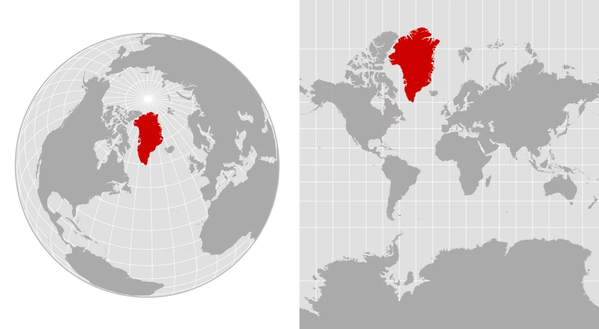
In physical terms, Greenland covers more than 836,000 square miles, making it the largest island on Earth. That size is substantial, but not nearly as overwhelming as it appears on many commonly used world maps. When compared accurately, Greenland is dramatically smaller than continents that appear similar in scale on classroom walls or digital screens. This visual inflation has quietly influenced interpretations of its strategic weight, territorial value, and role in global politics.
Modern geographic data maintained by institutions such as the U.S. Geological Survey confirms Greenland’s dimensions with precision. However, the public imagination continues to be shaped by projections that stretch high-latitude regions beyond their true proportions.
Why common world maps exaggerate Greenland’s size
The distortion stems from the challenge of flattening a spherical Earth onto a two-dimensional surface. One of the most widely used systems, the Mercator projection, preserves angles and navigation paths but sacrifices accuracy in area. As latitude increases, landmasses expand visually, causing regions near the poles to appear far larger than they actually are.
This mathematical stretching explains why Greenland can look comparable in size to Africa on many maps. In reality, Africa’s land area is roughly fourteen times larger. Digital mapping platforms, which include those based on Mercator-style projections, reinforce this illusion. They prioritize usability and navigation over proportional accuracy.
Organizations like National Geographic have documented how these distortions affect geographic literacy. This is particularly true when map users are unaware that the map is a compromise rather than a neutral depiction of space. The result is a persistent misreading of scale. This subtly reshapes discussions about territory, resources, and influence.
Alternative projections and shifting perceptions of scale
In response to long-standing criticism, cartographers have developed alternative projections. These attempts balance shape, distance, and area more equitably. Projections such as Robinson and Equal Earth reduce the dramatic expansion of polar regions. They allow Greenland to appear closer to its true size relative to other landmasses.
The push toward more representative mapping systems has gained institutional support. Educational bodies and international organizations rely increasingly on projections that reflect proportional reality rather than navigational convenience. Research shared through academic geography departments, including those indexed by Penn State University, emphasizes a key point. No single projection is universally correct. Each is more appropriate depending on purpose.
Choosing a projection is ultimately a decision about priorities. Maps designed for navigation will differ from those meant to communicate demographic, environmental, or geopolitical data. When projections exaggerate Greenland’s size, they can unintentionally amplify narratives about dominance or scarcity. These reinforce assumptions that may not align with physical geography.
Strategic geography beyond visual scale
While Greenland’s apparent size may be misleading, its strategic relevance is not. Its Arctic location places it at the intersection of emerging shipping routes, defense corridors, and climate-sensitive regions. Melting ice is opening new maritime pathways and exposing mineral resources. This elevates Greenland’s geopolitical profile regardless of its actual land area.
Climate data from agencies such as NASA shows that Arctic regions are warming faster than the global average. This accelerates environmental and strategic changes that affect Greenland directly. These developments underscore why accurate geographic understanding matters. Distorted maps can oversimplify complex realities. Meanwhile, clearer projections support more informed policy debates.
Ultimately, Greenland’s importance cannot be measured solely by how large it appears on a map. Its true significance lies in location, infrastructure, and global systems in flux. Correcting visual distortions does not diminish Greenland’s role on the world stage. Instead, it sharpens the context in which its future is being negotiated.