A Return to a Traditional Typeface Across Diplomats Worldwide
The State Department has restored Times New Roman 14-point as the required font for all official communications, launching an agency-wide shift that replaces the previous typeface and reestablishes a visual identity used for nearly two decades. The directive, issued under Secretary of State Marco Rubio, instructs embassies, consulates and Washington-based offices to immediately update internal memoranda, formal correspondence and externally shared documents. The renewed policy emphasizes that consistent formatting strengthens institutional credibility and reinforces a unified diplomatic presence.
Times New Roman served as the agency’s predominant typeface from 2004 to 2023, a period during which it became associated with formal federal communication. The decision to return to this serif font comes as part of a broader effort to align government agencies with uniform design protocols, an approach reflected in a variety of federal style guidelines, such as those referenced on USA.gov for general public communication standards.
The Debate Over Serif and Sans-Serif Fonts in Accessibility Policies
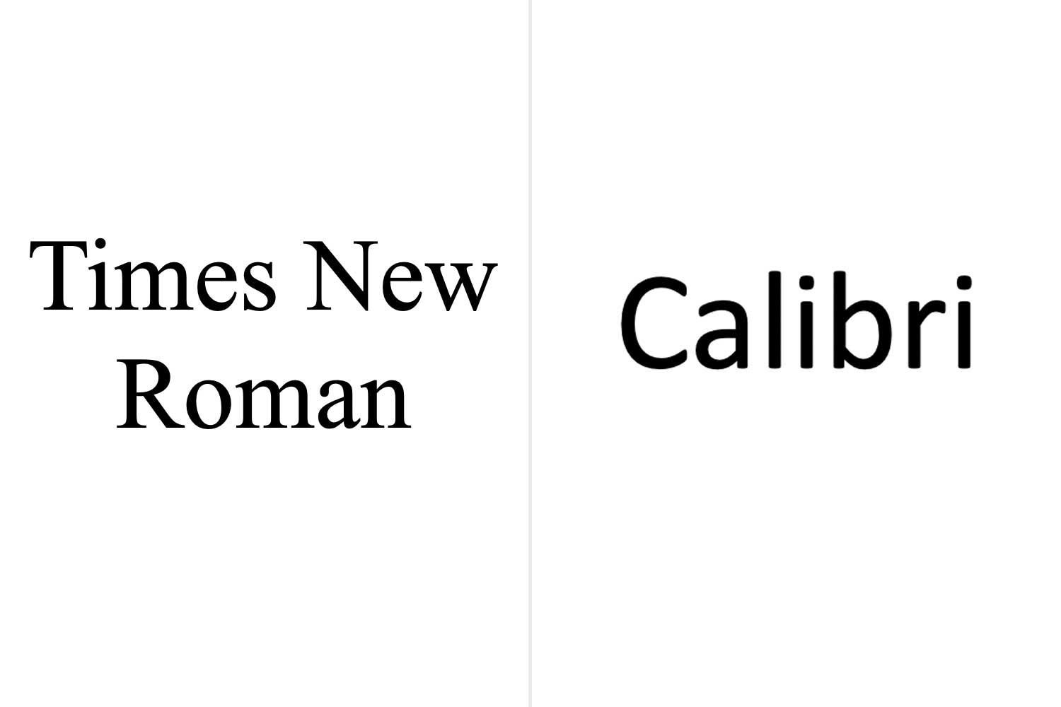
The reversal centers on the longstanding discussion between serif fonts—such as Times New Roman—and sans-serif alternatives like Calibri. Serif fonts include decorative strokes that can influence the reading experience, while sans-serif fonts typically present cleaner lines. For many accessibility advocates, sans-serif typefaces help reduce visual clutter, potentially supporting readers with dyslexia or limited vision. However, serif fonts remain prevalent in printed books, legal documents and most traditional publications.
In the United States, accessibility guidelines frequently cite the benefits of sans-serif fonts for signage and digital screens, consistent with interpretations of disability standards available through resources like the ADA.gov site. Despite these considerations, federal agencies continue to balance legibility with expectations of professionalism and institutional appearance, a tension reflected in previous font changes and ongoing internal debates. The State Department emphasized that serif fonts communicate formality and continuity, elements that reinforce diplomatic authority.
A Font Choice Connected to Larger Government Directives
Secretary Rubio’s return to Times New Roman fits within a wider set of administrative goals aimed at consolidating communication procedures throughout federal institutions. The decision aligns with the current administration’s “One Voice for America’s Foreign Relations” directive, a policy designed to strengthen the clarity and cohesiveness of official statements, reports and outreach materials. According to internal discussions, this approach prioritizes uniformity as a tool for conveying reliability in both domestic and international contexts.
Shifts in government aesthetics—including document styles, architectural preferences and public-facing language—have become increasingly central to policy identity. These design-driven decisions mirror other federal guidelines found on resources like WhiteHouse.gov, which frequently outline administrative priorities that shape national communication practices. As design choices become more publicly scrutinized, typography has emerged as yet another element through which agencies express their commitment to professionalism and consistency.
Evolving Standards in Government Communication and Digital Readability
The restoration of Times New Roman also arrives during a broader transformation in the digital ecosystem. Over the last decade, software developers, including major operating system and word processing platforms, have updated their default typefaces to improve screen readability. As part of this evolution, new sans-serif fonts optimized for high-resolution displays continue to appear across devices used throughout the federal workforce, including tools provided through platforms like the GSA’s technology services portal.
However, officials determined that a serif font remains the best representation of formality for diplomatic communication. The agency’s renewed mandate reflects a preference for typography that underscores tradition, hierarchy and institutional structure. For many career diplomats, Times New Roman carries a symbolic association with decades of precedent, offering a familiar standard across printed reports, treaties, briefing papers and interagency correspondence. With the reinstatement in effect, offices worldwide have begun updating templates, diplomatic cables and briefing materials to reflect the restored design requirements.